When to use a Mascot Style Logo Design?
Mascot logos turn a business into something people can recognize, remember, and even relate to. Used correctly, it’s one of the most powerful ways to stand out—especially in industries where most brands look the same.
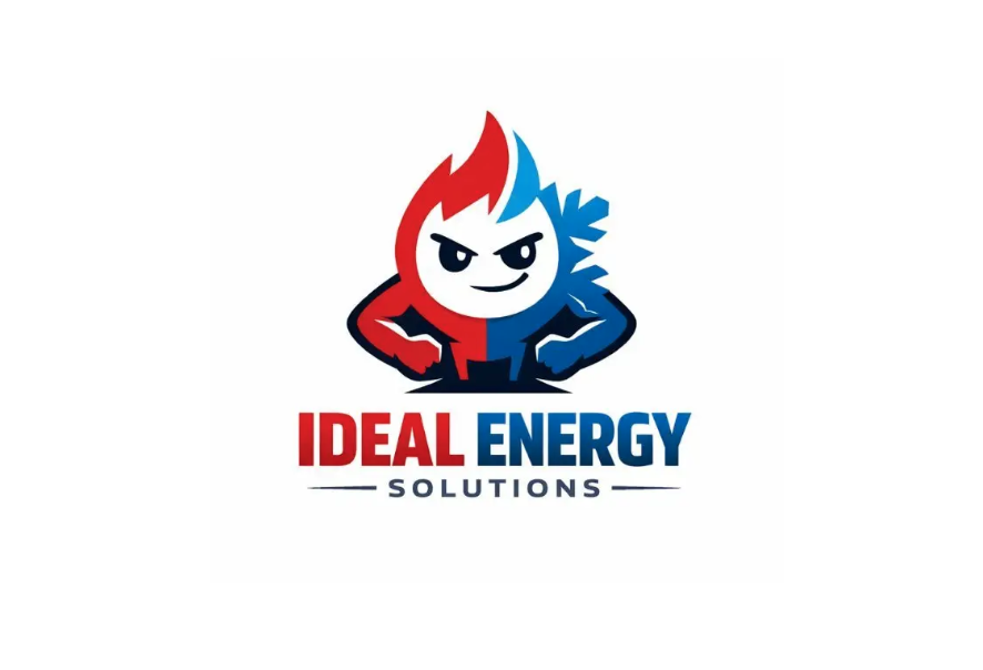
This is a mascot logo, where the brand identity is built around a character—in this case, a stylized energy figure combining fire and ice elements.
It’s a popular style in modern branding, gaming, and service businesses because it creates an immediate emotional connection.
Key Characteristics of This Logo
1. Character-Centric Design
- The main focus is a personified energy figure
- Split design:
- 🔥 Red flame (heat, power)
- ❄️ Blue ice (cooling, control)
👉 This duality visually communicates:
“We handle both sides of energy (heating & cooling).”
2. Strong Personality
- Confident stance (arms on hips)
- Slight smirk and sharp eyes
👉 Gives the brand a bold, reliable, slightly playful personality—not boring or corporate.
3. Bold, High-Contrast Colors
- Red vs Blue contrast
- White face for clarity
👉 This makes the logo:
- Highly visible
- Easy to recognize
- Emotionally charged (hot vs cold)
4. Thick Outlines & Simplified Shapes
- Cartoon-style rendering
- Clean edges and strong silhouette
👉 Ensures the logo works well:
- On trucks
- Uniforms
- Ads and signage
5. Supporting Typography
- Bold sans-serif for “IDEAL ENERGY”
- Smaller, spaced-out “SOLUTIONS”
👉 The text complements the mascot without overpowering it.
Why This Logo Works
This design is effective because it:
- Explains the business instantly (heating + cooling)
- Builds memorability through a character
- Feels approachable (not too corporate)
- Creates brand differentiation in a commoditized industry
👉 Compared to generic HVAC logos, this one actually has identity.
When You Should Use a Mascot Logo
✅ Best Use Cases
1. Local Service Businesses
- HVAC (like this example)
- Plumbing
- Electrical
- Cleaning services
👉 Mascots make brands feel friendly and trustworthy
2. Competitive Consumer Markets
- Where many brands look the same
- Mascots help you stand out quickly
3. Brands That Want Personality
- Fun, bold, approachable tone
- Not overly formal
4. Marketing-Heavy Businesses
- Ads, trucks, billboards
- Mascots are great for visual recall
When NOT to Use a Mascot Logo
❌ Avoid if:
1. Enterprise / B2B SaaS
- Feels less serious or scalable
2. Luxury Brands
- Mascots can feel less premium
3. Minimalist Brand Systems
- Too complex for clean UI environments
Design Technique Breakdown
What makes this mascot particularly strong:
- Concept clarity → fire + ice = core service
- Symmetry split → visually balanced and meaningful
- Expression design → confident but not aggressive
- Color psychology → intuitive (hot vs cold)
- Silhouette strength → recognizable even at a glance
👉 It’s not just a character—it’s a visual explanation of the business.
Key Takeaways
If you’re considering a mascot logo:
- Use a character that represents your core service
- Keep shapes simple and bold
- Make sure it works in real-world applications (vehicles, uniforms)
- Give it a clear personality aligned with your brand
Final Thoughts
Mascot logos like this turn a business into something people can recognize, remember, and even relate to.
Instead of just a name, you get:
A face, a personality, and a story.
Used correctly, it’s one of the most powerful ways to stand out—especially in industries where most brands look the same.
Ready to create your own logo?
Turn your brand name into professional logo concepts in seconds with AnyLogo.
Generate my logo