Luxury Retail Logo: Elegant Serif + Minimal Symbol
The AFFINI – A Candle Bar logo is a great example of a modern luxury retail logo style. It’s quiet, refined, and intentionally restrained—which is exactly how luxury branding works.
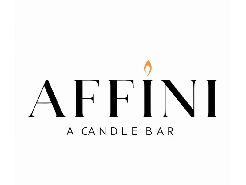
The AFFINI – A Candle Bar logo is a great example of a modern luxury retail logo style, built on three core principles:
Elegant typography + minimalism + subtle symbolism
It’s quiet, refined, and intentionally restrained—which is exactly how luxury branding works.
✨ 1. High-Contrast Serif Typography
The main wordmark uses a thin–thick serif font (similar to Didot/Bodoni style).
Why it works:
- Feels premium and editorial (like fashion magazines)
- High contrast strokes → adds sophistication
- Wide spacing → creates a sense of air and exclusivity
👉 This is the same typographic language used by:
- Fashion brands
- Beauty brands
- Luxury boutiques
🔥 2. Minimal Symbol (The Flame Accent)
The only graphic element is a small flame above the “I”.
Why it works:
- Directly ties to the product (candles)
- Replaces a typical dot → integrates into typography
- Adds personality without clutter
👉 This is a key luxury technique:
Use one small, meaningful detail instead of many elements.
⚫ 3. Black + Subtle Accent Color
- Black typography → timeless, authoritative
- Soft gold/orange flame → warmth and elegance
Why it works:
- Black = luxury, confidence, simplicity
- Warm accent = emotional connection (comfort, ambiance)
👉 Luxury brands rarely use many colors—they rely on restraint.
🧘 4. Minimalism = Premium Feel
Notice what’s not here:
- No gradients
- No shadows
- No complex icons
Why it works:
- Feels clean and confident
- Suggests the product speaks for itself
- Avoids looking “mass market”
👉 In luxury:
Less design = more perceived value
🔤 5. Strong Hierarchy
- AFFINI → large, dominant
- A CANDLE BAR → small, spaced-out descriptor
Why it works:
- Brand name feels like a label or signature
- Tagline adds context without competing
👉 This mirrors high-end packaging design.
🕯️ 6. Emotional Positioning
Everything about this logo communicates:
- Calm
- Warmth
- Sophistication
- Experience (not just product)
👉 It feels like:
A boutique experience, not just a candle shop
When to Use This Style
✅ Perfect for:
- Candle brands
- Beauty / skincare
- Fashion labels
- Boutique retail
- Hospitality (bars, lounges, spas)
❌ Not ideal for:
- Playful or kids brands
- Tech startups (unless luxury positioning)
- Mass-market discount products
💡 Design Takeaways
If you want to design in this style:
- Choose a high-contrast serif font
- Add one subtle, meaningful icon (not more)
- Use limited colors (black + 1 accent)
- Embrace spacing and simplicity
- Think in terms of experience, not just function
Final Thoughts
This logo works because it doesn’t try to impress loudly.
It quietly signals:
“We are refined, intentional, and premium.”
And in luxury branding, that quiet confidence is exactly what makes it powerful.
Ready to create your own logo?
Turn your brand name into professional logo concepts in seconds with AnyLogo.
Generate my logo