Scenic Illustration Logo: What type of brands should choose illustrative logo style
The “Water Front Inn” logo sits between a detailed illustration logo and a refined travel/hotel badge, designed to sell not just a place—but an experience.
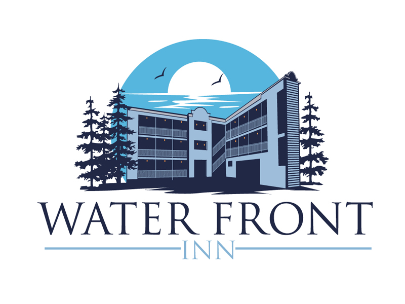
The “Water Front Inn” logo is a blend of:
Scenic illustration + hospitality branding + modern vintage style
It sits between a detailed illustration logo and a refined travel/hotel badge, designed to sell not just a place—but an experience.
🌅 Key Characteristics of This Style
1. Scenic Illustration (Place-Based Identity)
- Building (the inn)
- Water + horizon
- Trees + birds
- Sun/moon in the background
Why it works:
- Immediately communicates location + environment
- Feels like a destination, not just a business
- Creates an emotional picture
👉 You can almost imagine staying there.
2. Limited Color Palette (Duotone Feel)
- Blues + muted tones
- Soft contrast
Why it works:
- Feels calm, relaxing, and coastal
- Keeps the illustration from becoming too busy
- Maintains a premium, cohesive look
👉 Very common in hospitality and travel branding.
3. Architectural Focus
Unlike rustic logos (cabins, etc.), this one highlights:
- A structured building
- Clean lines and perspective
Why it works:
- Signals comfort, reliability, professionalism
- Appeals to guests looking for a real place, not just vibe
4. Elegant Serif Typography
- “WATER FRONT” → large, refined serif
- “INN” → smaller, spaced out
Why it works:
- Feels classic and trustworthy
- Matches hospitality expectations
- Balances the illustration with sophistication
5. Framed Composition (Badge-Like)
- Illustration on top
- Text below
- Centered alignment
Why it works:
- Clean hierarchy
- Easy to adapt across signage, websites, print
- Feels like a destination brand mark
🧠 Why This Style Works
This style communicates:
- Experience → not just a room, but a stay
- Place → waterfront, peaceful, scenic
- Trust → structured building + serif font
- Emotion → calm, retreat, escape
👉 It’s selling:
“Come stay here and relax.”
🏨 When You Should Use This Style
✅ Best Use Cases
- Hotels / inns / resorts
- Airbnb / vacation rentals
- Travel brands
- Real estate (destination-focused)
- Retirement communities
❌ When NOT to Use It
- Tech startups
- Minimalist SaaS products
- Brands needing ultra-simple icons
- Businesses without a strong physical location
👉 This style depends on place and atmosphere.
⚙️ Design Technique Breakdown
What makes this logo effective:
- Layered illustration → depth (building, water, sky)
- Color restraint → avoids clutter
- Strong silhouette → readable even simplified
- Balanced typography → complements, doesn’t compete
👉 It’s a mix of:
Illustration storytelling + brand clarity
💡 Key Takeaways
If you want to design in this style:
- Anchor your design in a real place or environment
- Use limited colors for cohesion
- Combine illustration + elegant typography
- Focus on mood and experience
- Keep composition clean and centered
Final Thoughts
This logo works because it doesn’t just identify a business—it invites you somewhere.
It tells a story:
Water, calm, comfort, and a place to stay.
And that’s exactly what great hospitality branding should do.
Ready to create your own logo?
Turn your brand name into professional logo concepts in seconds with AnyLogo.
Generate my logo