Twitch Logo: Design your own Gaming / Techno Block Typography logo
The Twitch logo is a classic example of blocky gaming typography. It’s designed to feel digital, bold, and unmistakably “gaming culture.”
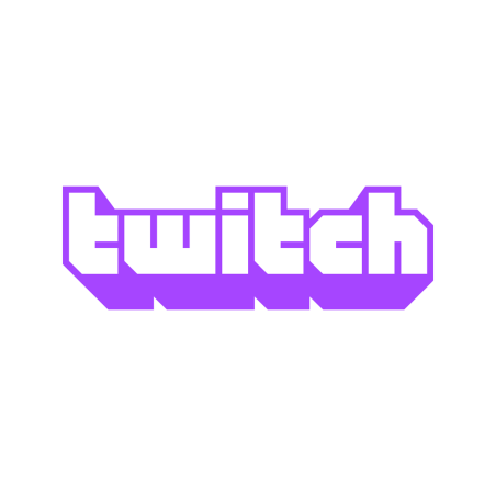
The Twitch logo is a classic example of blocky gaming typography, often described as:
- Esports / gaming logo style
- Techno / geometric block font
- Retro pixel-inspired typography
It’s designed to feel digital, bold, and unmistakably “gaming culture.”
🎮 Key Characteristics of This Style
1. Blocky, Geometric Letterforms
- Letters are built from hard edges and straight lines
- Almost no curves
- Feels like it’s constructed from blocks or pixels
👉 This connects directly to:
- Early video games
- Digital interfaces
- Screen-based environments
2. Pixel / Retro Influence
Even though it’s modern, the style hints at:
- 8-bit / 16-bit games
- Old-school arcade aesthetics
👉 This gives it:
A nostalgic + modern hybrid feel
3. Bold and Compact Structure
- Thick letterforms
- Tight spacing
- Strong silhouette
👉 Makes it:
- Easy to recognize
- Great for icons and overlays
- Perfect for streaming environments
4. Signature Purple Color
Twitch’s purple is iconic.
Why it works:
- Distinct from competitors (YouTube = red, etc.)
- Feels creative, digital, slightly unconventional
- Appeals to gamers and creators
👉 Color becomes part of the identity system.
🧠 Why This Style Works
This style is perfect for Twitch because it communicates:
- Digital-native → born on the internet
- Gaming-first → rooted in game culture
- Bold personality → not corporate or boring
- Community-driven → approachable and fun
👉 It feels like:
A platform built by and for gamers
⚡ When You Should Use This Style
✅ Best Use Cases
- Gaming platforms
- Streaming / content creator brands
- Esports teams
- Developer tools (with gamer audience)
- Youth-focused digital products
❌ When NOT to Use It
- Luxury brands
- Professional services (law, finance, consulting)
- Minimalist premium SaaS
- Brands needing warmth or elegance
👉 This style is intentionally loud and digital, not refined.
⚙️ Design Technique Breakdown
What makes the Twitch logo strong:
- Custom letter shapes → not a standard font
- Consistent stroke thickness → clean and structured
- Sharp corners → reinforces digital feel
- Compact layout → great for UI and overlays
👉 It’s built for screens first, everything else second.
💡 Key Takeaways
If you want to design in this style:
- Use geometric, block-based letter construction
- Minimize curves → lean into sharp edges
- Keep shapes thick and bold
- Choose a distinct, ownable color
- Optimize for small-size readability (icons, UI)
Final Thoughts
The Twitch logo works because it fully commits to its world:
It doesn’t try to look premium or corporate—it looks like gaming.
And that authenticity is exactly what made it iconic.
Ready to create your own logo?
Turn your brand name into professional logo concepts in seconds with AnyLogo.
Generate my logo